David Cordero
UX / Dev
Published on 08 Oct 2016
One of the most important things to keep in mind when building mobile Apps, is thinking about the user. It is not that easy trying to understand the problems or needs of our users, and the reason that led them to use our App to solve those problems or needs.
No matter how great is your app, and how well it was developed and designed. Apps are always a handicap, the handicap that users have to suffer to get the valuable part of your product, the part that is actually giving a solution for their problem or need.
I really like how designers keep users on their minds when designing Apps. Not only trying to get Apps visually attractive, but also trying to make them intuitive and easy to use. They usually discuss every issue with a clear separation in terms of UI and UX. Fortunately we already overcame these days of insanely complex UIs trying to collect every single feature that the product manager decided to add to the product.
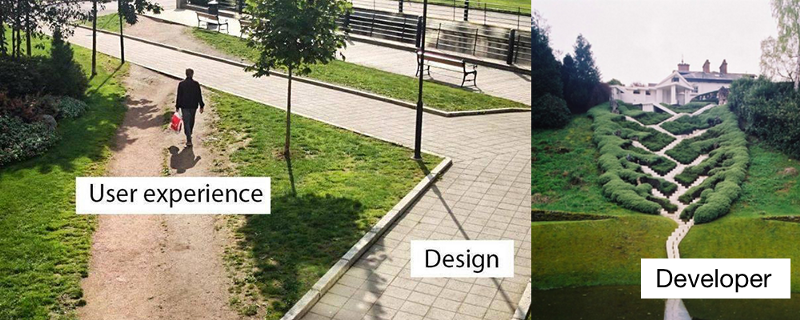
On the other hand, at least based on my experience, it is quite rare to find developers trying to put themselves on the users’s shoes.

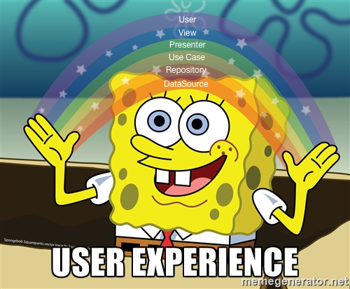
You can usually find developers discussing about software architecture, programming languages, automation of tedious tasks, etc…, which of course also have an indirect impact on the user experience, but the frontier between UX and Dev is not that clear.
UX, in my opinion, shouldn’t be considered as an exclusive issue of designers. User experience in fact, is a quite huge concept. The experience of our users is actually affected by almost everything around at the moment of launching the App and start pressing buttons. It can be the UI of course, but also the network speed, the performance of the device, or even things like the weather or the user’s mood.
Sadly due to the fact that we can not change the weather or the user’s mood, there is just a few fields in which we can improve the experience of our users.
As designers, we can of course improve the UI. But there is also a huge amount of things we can do as Developers to improve the user experience and making it less frustrating, being, as developers, essential contributors of UX.

Performance
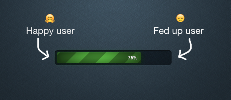
Waiting times are probably the most obvious case of UX being affected by developers. A progress bar is by far the most annoying experience that a user can suffer. A progress bar is a really bad experience, blocking our users while trying to get value from your app.
There is not too much to do in terms of design to improve this experience. Designers could create a fancy design for the progress bar, adding funny animation which could create a more entertaining experience, but the user will fed up of the animation after being presented hundred of times.

As developers on the other hand, there is a lot of things we can do to improve that experience: launching network requests on the background without blocking the user, prefetching the data to have it available immediately when the user actually need it, caching as much data as possible to avoid touching the network unless it is really needed, or including an initial set of assets to allow the App starting immediately without a network dependency, etc… Performance is definitely a very important point for the users, there are thousands of success Apps with horrible designs but offering a great performance experience. This is probably why craiglist.org is one of the most visited websites on the USA, or why milanuncios.com is more used than any of their visually attractive competitors in Spain.
Offline experience
We are living in a mobile world and our Apps are not longer a website visited from a desktop with a stable internet connection. Our Apps are now part of a moving experience which could result on connectivity interruptions.
Missing internet connection is not actually an error anymore, but a very likely situation, and we should prepare our Apps to deal with this situation providing a smooth experience to our users.
Caching is a very important point for getting a nice offline experience. Going from a detail view back to the listing for example, shouldn’t be a problem when missing connectivity. Or even certain user actions, which could requires connectivity could be queued to be performed as soon as we get connectivity instead of presenting an annoying error to the user.
I invite you to active the flight mode in your phone and to open your App to check the result.
Errors management
As developers we are experts in finding corner cases. It is a usually our job to find the huge amount of things that could go wrong, and at the end we are able to discover all this cases almost immediately. I really like when developers start asking “But, wait, what if….” even before receiving the complete specifications.
This is why I think that developers can offer a lot to improve UX in terms of error management. Asking for designs and messages for all those corner cases they can think about.
Apart from that, developers could also make the Apps for trying to solve certain problems internally instead of presenting errors to the user. Or retrying when it make sense.
Internal errors like weird deserialization problems or corrupted caches could be solved internally clearing the cache instead of presenting generic errors to the users. Who can’t do too much to solve something like this apart from deinstalling the App, which is not what we want right?
Accessibility
Accessibility is nowadays a very easy task to be added to our Apps, in fact when using operating systems as iOS or tvOS, accessibility labels are automatically generated in most of the cases an we don’t have to do anything.
But it is our responsibility as developers to provide accessibility labels for all these other items where the operating system is not able to infer an appropriate accessibility label, like it happen when using icon fonts or unlabelled buttons.
It is also very important in terms of UX to group elements with a relationship allowing deep navigation into them, for example scrolling lists by cells instead of by every single view inside each cell can improve a lot the experience of our clients making use of accessibility mechanisms.
API design
In most of the cases Apps are just an attractive facade for a REST API. On one side we have an user consuming data, and on the other side we have a server providing this data, as simple as that.
And the truth is that sometimes, the design of our APIs can result in annoying experiences for our users. Due to the fact that as developers we are the only ones knowing the technical limitation of our APIs, we are the only one who can propose changes on them in order to improve the user experience.
For example, in certain cases APIs returning a simple success or failure as result of login could be improved adding user information to the success response, which could avoid additional requests from the clients fetching user data right after login. Or endpoints listing elements could be modified to include at least the basic information for each listed element which could allow presenting a details screen without the need of touching the network.
Of course all of these examples are not valid for everyone, they depends on your specific case and they should be discussed with your backend developers. But the message is that, whenever possible, as developer we should try to improve our APIs in benefit of our users.
Conclusion
UX is not an exclusive issue of design, developers are in fact essential contributors for the user experience and they should try to improve the experience of our users whenever possible.
Product managers usually write tasks in terms of “As a user…”, that could be a good hint the next time that a new tasks is faced. Start thinking as a user, can lead to avoiding annoying experiences.
Of course, there will be always technical limitations for certain scenarios, but reducing them to the bare minimum is our responsibility as engineers. And working together with designers can reduce their impact getting at the end great products which users love.
Feel free to follow me on github, twitter or dcordero.me if you have any further question.